SUBURB/LOCATION:Chermside Health Hub
Creating a hybrid allied health service office design, balancing open plan and closed offices with a fresh, clean palette.
SIZE
210 sqm
TIMEFRAME
8 weeks
THE BRIEF
Aged care provider Just Better Care sought a new layout and look for their office at the Chermside Health Hub. The team had previously used an office with cubicles and closed areas, and initially sought that for their new premises. However, working with the team, it was determined to move to a more contemporary blended style of offices and open plan. The design and features overcame the initial concerns about privacy and noise.
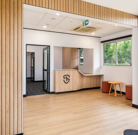
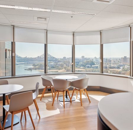
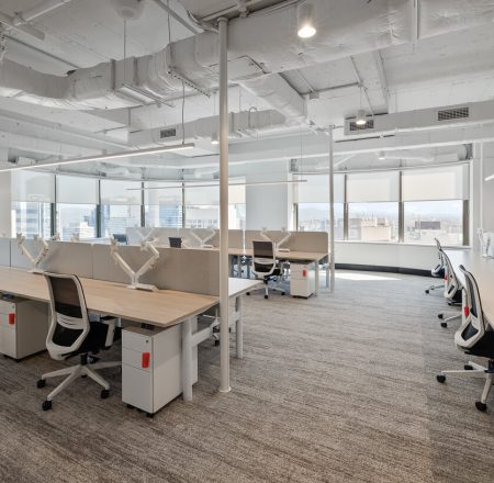
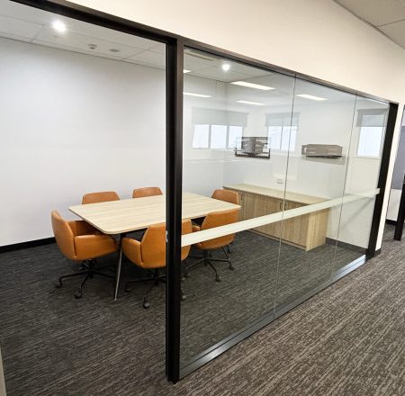
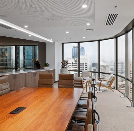
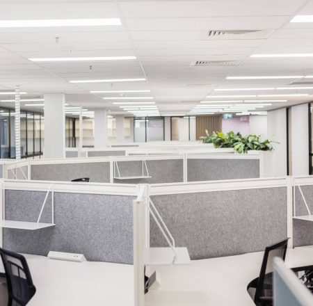
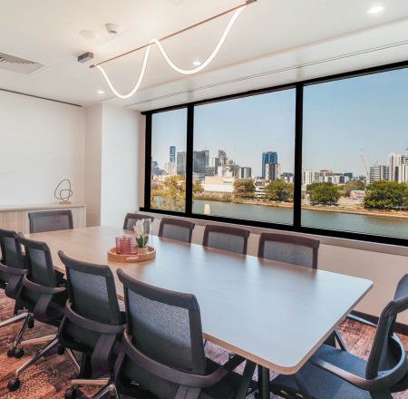
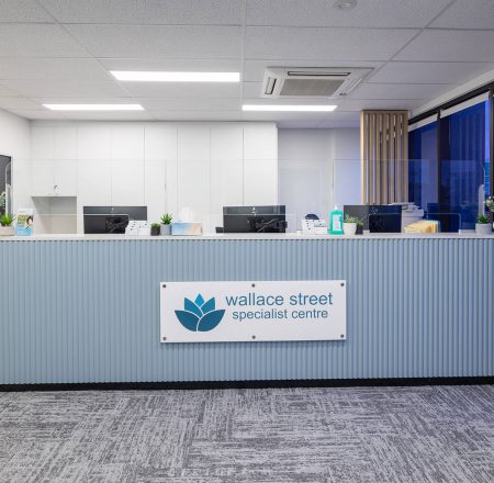
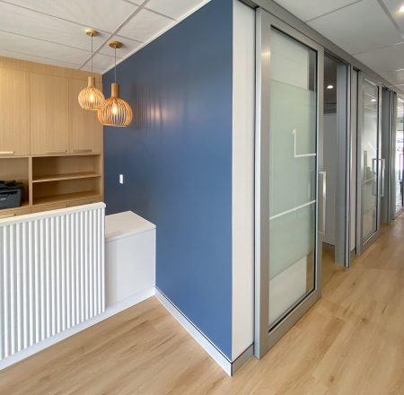
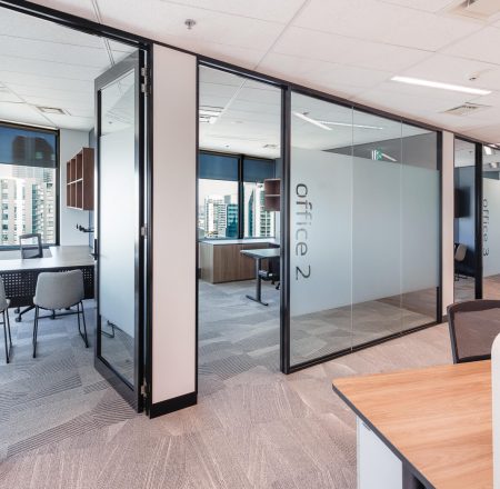
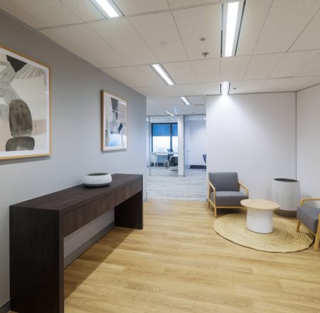
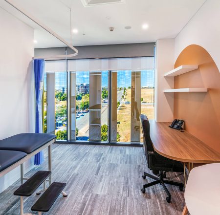
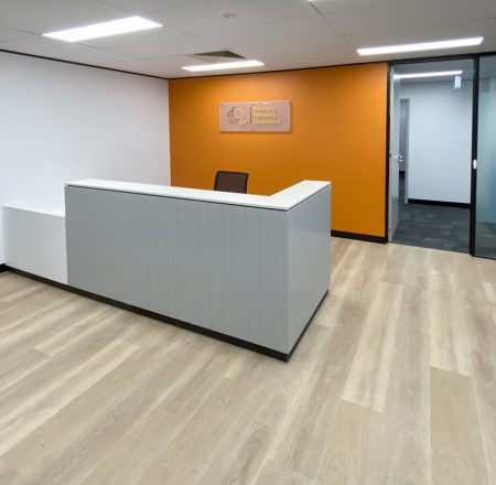
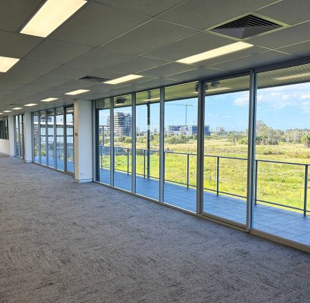
The new fitout involved four open areas, covering 210 sqm, with a focus on maximising access to natural light and staff comfort. There is also a boardroom that doubles as a training area and a public-facing reception area.
DESIGN
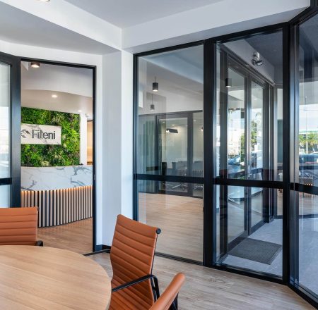
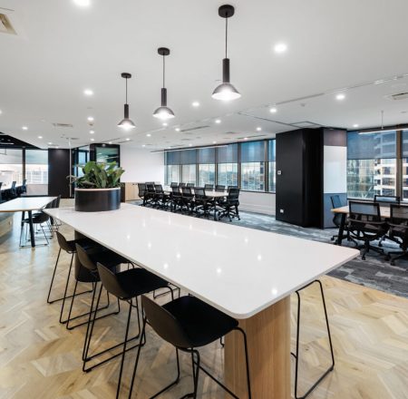
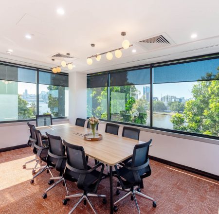
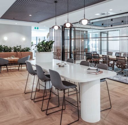
The project was a modern hybrid office, balancing open-plan areas with private spaces. The open-plan areas are set out in blocks of four workstations. This reduces the noise but still allows for interaction between staff. The boardroom, with a large table for 10, is also easy to move around and reconfigure the space. The company does this for its regular training sessions.
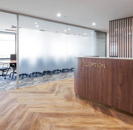
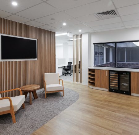
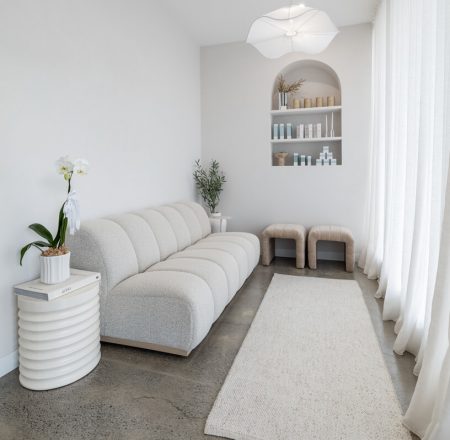
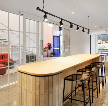
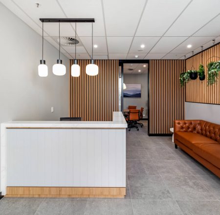
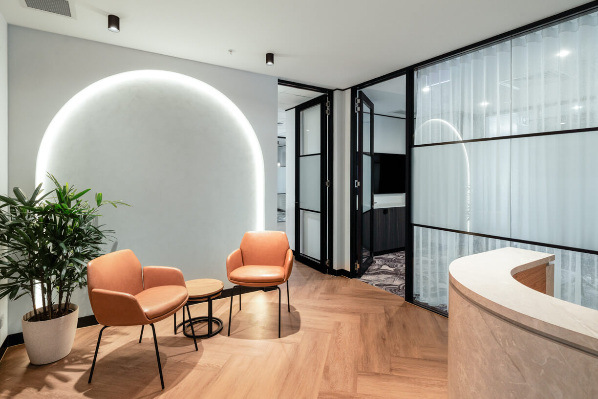
Key design elements include acrylic logo signage with red accents reinforcing the corporate brand and a backlit arch in the waiting area. The public waiting area is welcoming and approachable through the use of light oak laminate and a complementary light grey with a rich vein throughout. Contemporary LED strip lighting and pendants provide accents throughout the office, while the durable carpet and herringbone-pattern flooring adds interest to the communal areas. There is a combination of natural tones and textures for a warm ambience.
CONSTRUCTION
The construction project proceeded to plan, with the materials and contractors ready as scheduled. The clients were involved in the process from the start of design, making it a terrific collaboration. Mindful of the concerns over noise, we included acoustic-rated plasterboard partitions to the underside of the ceiling.
One standout feature was the illuminated arch in the reception area, which added a striking visual element and created a welcoming first impression for staff and guests. Warm lighting in the meeting rooms contributes to a calm and inviting atmosphere.
THE OUTCOME
We were thrilled at the response we received from Just Better Care’s Susanne Jones.
“I can truly say that RAW Commercial have provided us with the best tailored customer service around. I could not praise their responsiveness, timeliness and craftsmanship more. Plus, their pricing was very competitive. RAW Commercial delivered on their promise (design and timeline) and did so with integrity, professionalism, and great people skills (from all their staff). Ryan and Chris (our main POCs) were fantastic, and their designer, Henna, has an amazing eye for colour and design. From a business owner’s perspective, I can tell that Richard cares about his team and customers alike, which is a natural recipe for success, in my opinion. I would not hesitate to use them again in the future.”

